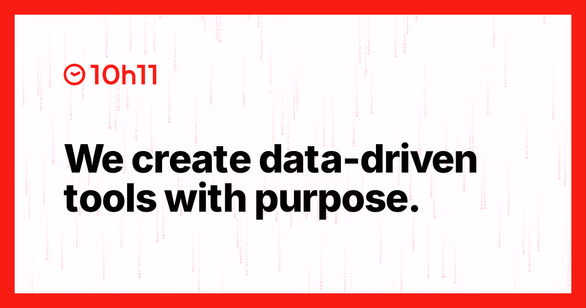
10h11: Back to Red, Back to the Essentials
Fourteen years ago, 10h11 entered the digital scene with a bold visual identity: red, white, and black. A deliberately striking palette — red like a matador’s cape — designed to grab attention and embody the fighting spirit of a young team passionate about data. Since then, the company has grown, opened a branch in Canada, launched countless projects… and experimented with many colors: “institutional” shades to appear more mature, pastels to soften the tone, monochrome variations to play it sober.
But after all this exploration, one thing became clear: a brand identity must reflect what the company truly is, not what it thinks it should look like. Today, 10h11 proudly returns to its original colors and a streamlined navigation experience, with a website that does exactly what the agency promises its clients: get straight to the point, deliver fast, and highlight the essentials.
Why now?
“We want to get back to the essentials: less talk, more clarity about our ability to produce, deliver, create beauty and order.”
This return to basics is part of a clear strategy:
- Show what we do best: innovative data projects, driven by rigor and creativity.
- Accelerate understanding: a concise showcase site reduces friction for prospects.
- Align experience with promise: our internal methods — structured and precise — must shine through the UX.
Red, white, black: unchanged symbolism
Back in 2011, red was chosen to represent the “eye-catching” aspect dear to the agency — to spotlight key information. Today, that same shade returns to convey:
- Fighting spirit: detecting the decisive data point that drives decision-making.
- Energy: the team’s ongoing curiosity and drive to learn.
- Creative rigor: the new logotype sharpens the angles of “10h11” to balance the roundness of the clock — a symbol of mastered tempo.
A simplified grid, three core blocks
The homepage, swept by a Matrix-style rain of numbers, sets the tone: go beyond the imaginable. It's now structured around a clear triptych:
- Home: an immersive entry point where data pours in — it immediately embodies the 10h11 promise (“see beyond appearances”) and guides the visitor.
- Work: the main showcase of references and the core of social proof. Each project appears in a clean grid, ready to explore.
- Services: 10h11’s offer, presented in three verbs — Collect, Analyze, Visualize — so everyone can understand how the team turns data into concrete results.
The red navigation bar, placed at the center of the screen like a ruler, acts as a visual anchor. No more sprawling menus: every click leads to the essentials, and the scroll reveals subtle micro-animations.
Performance: Form Serving Function
Streamlining also means optimization:
- Fewer assets = faster load times.
- Clarified navigation = fewer lost visitors, longer sessions.
- Improved accessibility: strong contrasts, crisp typography, smooth keyboard navigation.
Early feedback confirms the approach was right: “It feels like the sharp, direct 10h11 from the early days,” says a long-time client. A partner adds, “The site breathes and lets the work shine.”
A Collective Effort, a Shared Vision
The project mobilized the whole team — designers, developers, content strategist, PM — in “brand memory” workshops. The central red bar quickly emerged as the natural symbol of stability. The site structure, once a major sticking point, was resolved in five minutes: “Home / Work / Services will be our essentials.” When visuals are native, production flows smoothly.
By reviving its original red, 10h11 isn’t looking back — the agency is simply reclaiming the energy that sparked it into life: a love for data, the craft of shaping it, and the drive to make it useful. A return to the essentials that, far from narrowing the horizon, lays the groundwork for the next decade of innovation.
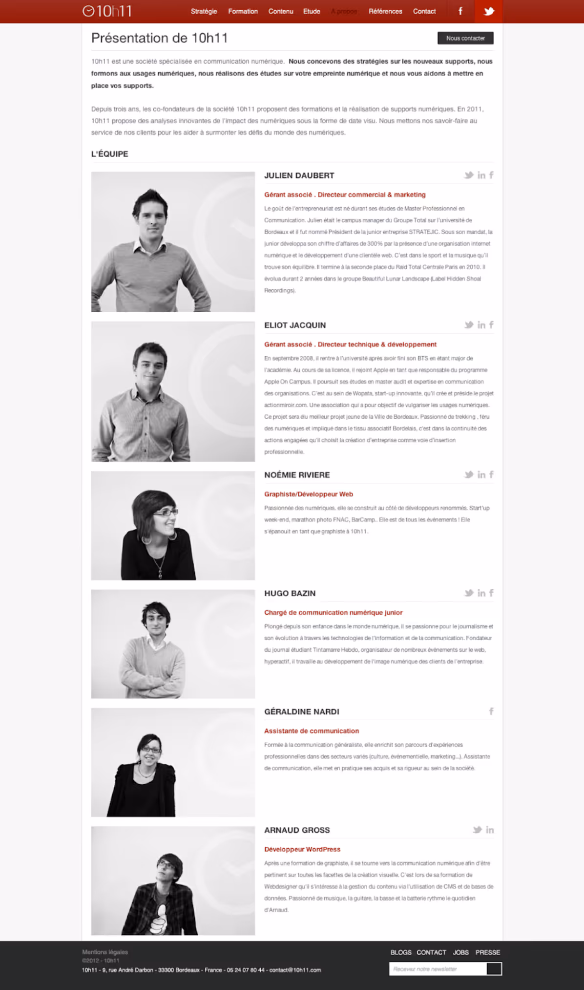
P.S.: 2011 site below: