CLIENT
Industry
services & TECHNOLOGIES
Duration

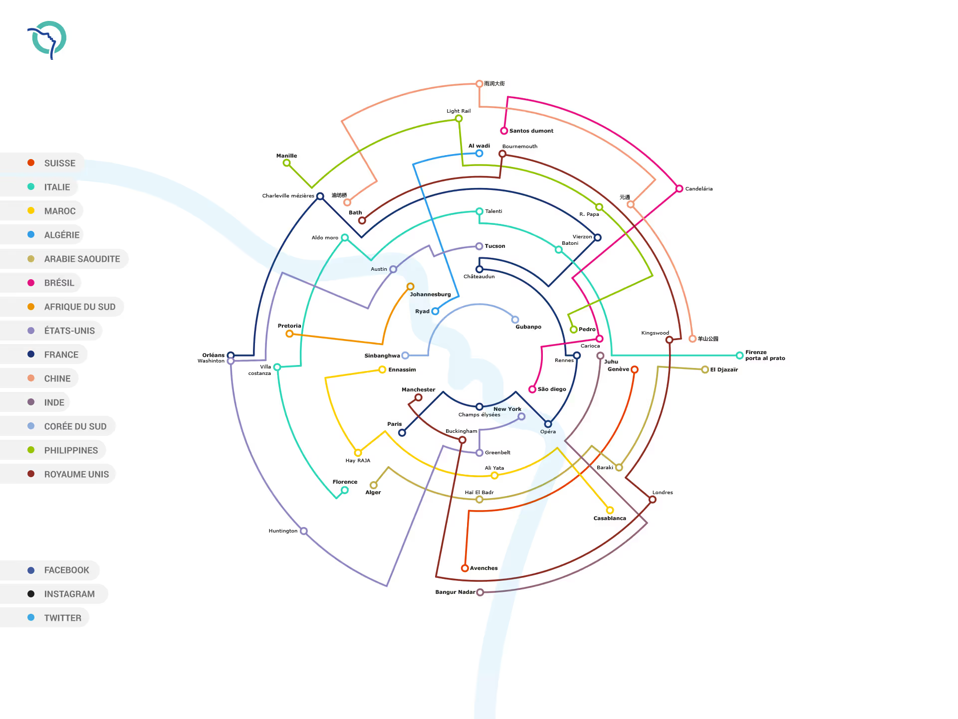
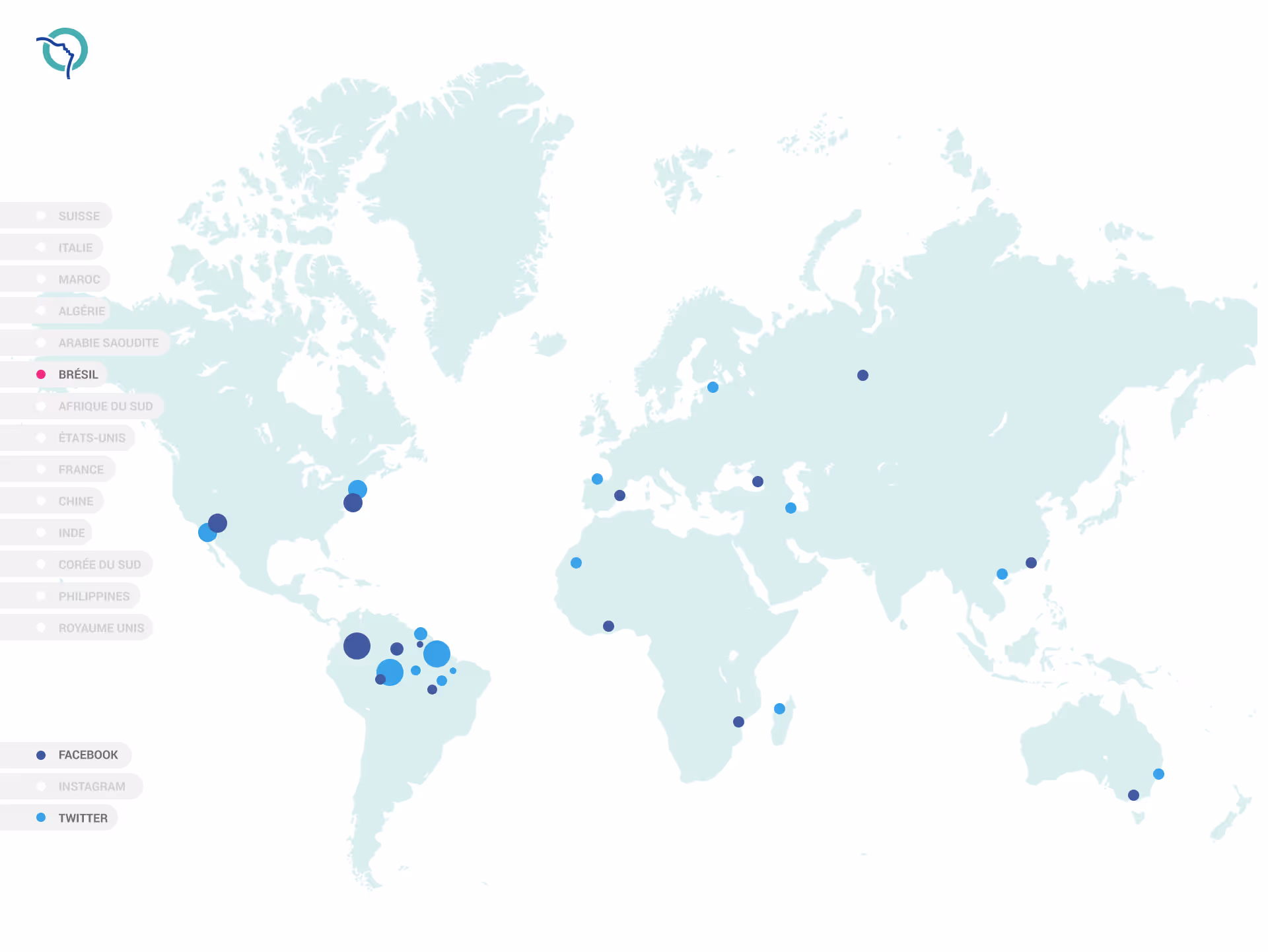
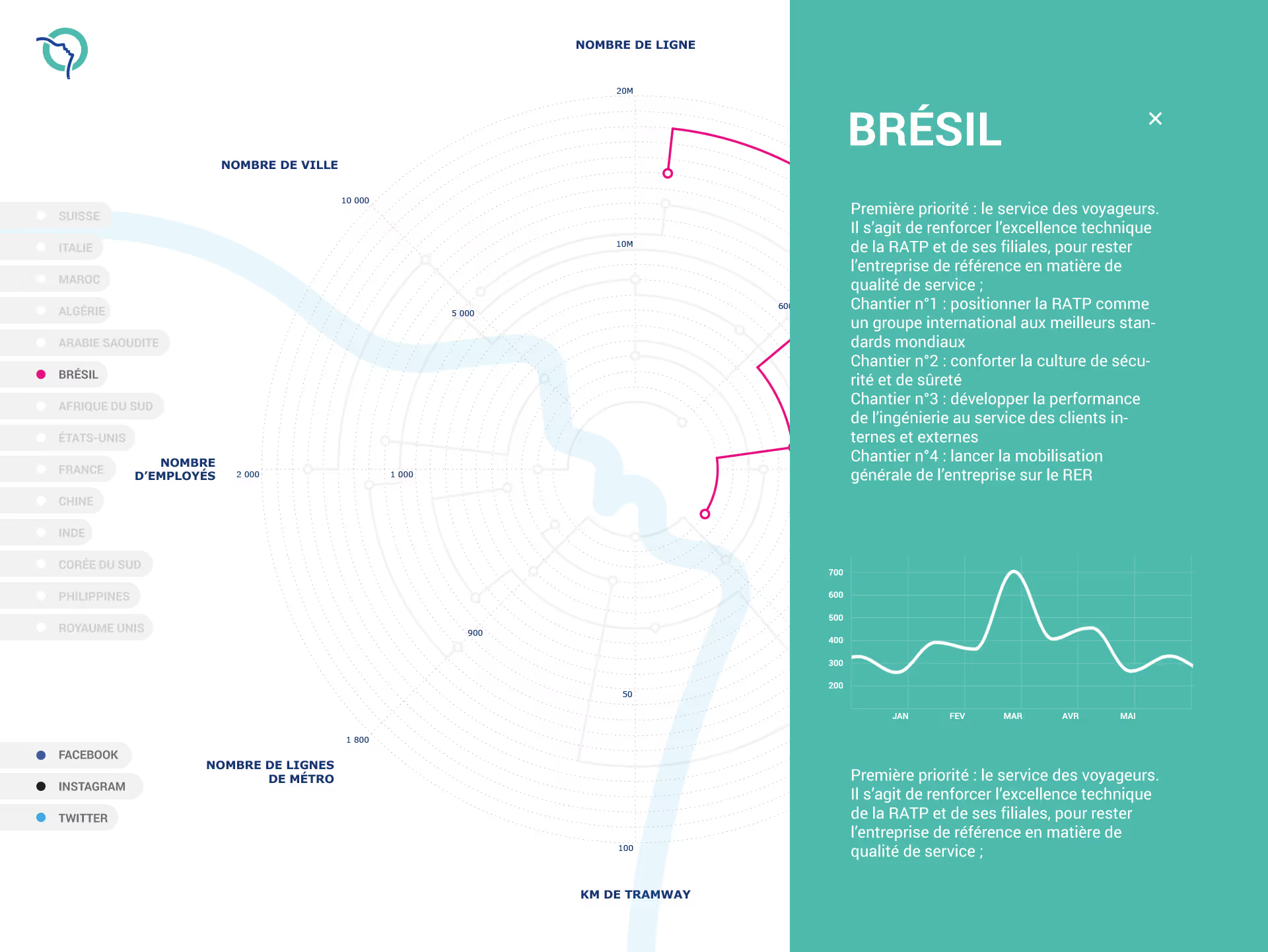
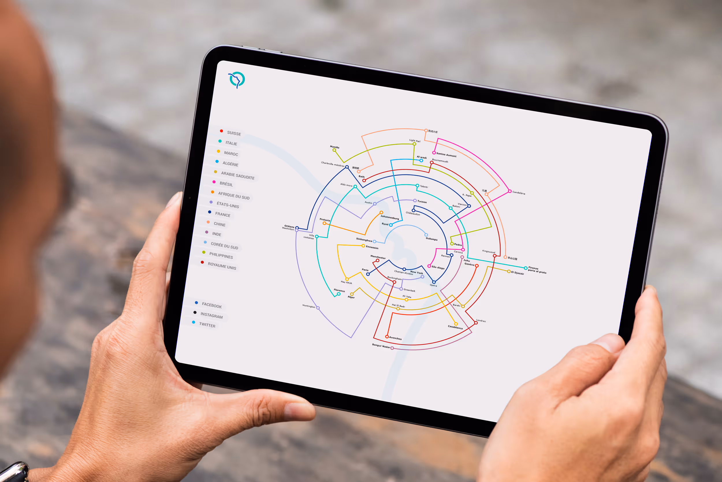
We designed a unique, interactive visualization for RATP to consolidate key operational indicators (cities, employees, investments, and more) across all countries, in one seamless and intuitive interface.
The RATP Group, one of the world's largest public transport operators, operates in 15 countries and across 9 different transport modes. To better showcase its global footprint and facilitate internal decision-making, RATP needed a centralized, interactive tool that would consolidate strategic data per country. We developed an innovative, circular visualization interface inspired by metro line diagrams. Accessible on tablet, the dashboard allows users to explore RATP’s activities across the globe: from the number of cities and employees to kilometers of tramway, number of lines, investment amounts, and social media indicators. The data can be filtered and navigated by country, making the complexity of global operations simple, visual, and actionable. This project combines advanced data visualization, interface design, and mobility data integration to support smarter decision-making and better internal communication.

The need
RATP required an engaging and comprehensive way to present key metrics about its operations around the world, including cities served, investment levels, infrastructure, and digital presence. The tool had to be clear, responsive, and designed for touch devices, to facilitate internal presentations and strategic reviews.
The solution
We designed a circular, multi-scale interface inspired by metro maps, allowing users to explore global data interactively. Built for tablets and touchscreens, the tool lets you select any country and access real-time contextual data through a sleek, dynamic design.
The outcome
The interface now offers RATP an innovative and intuitive way to visualize its international operations. This solution improves internal visibility, supports strategic communication, and makes mobility data accessible and engaging, all in one place.